Tuesday, March 23, 2021

Papercraft Object: Prototype

Here is my first attempt at building the creation I made previously in Rhino, The Great Deku Tree. As a side note I opted out of adding the mouth/moustache because I ended up making them much too small, and couldn't get them to a size good enough for crafting accurately as well as looking decent once on the sculpture.


Notes I made while and after building for Improvement on the Object:
-Make Trunk and top branches larger in order to better support bunches of leaves (Won't be crooked)
-Turn bottom roots into one piece to make crafting easier, and so that they are lined up with the ground (not raised)
- Make the cover under the leaves that are holding all of the pieces together larger so that it completely covers the bottom of them
-Remove some of the tabs on branches for easier assembly
-Reduce tab size on smaller pieces

Overall, I would call this project a success and am very pleased with the outcome. With the tweaks mentioned I think the project outcome will be exactly how I wanted it to turn out. Three cheers for the forests of Hyrule!


Papercraft Objects: Digital Sample

 Originally I was planning on creating a few different prototypes of objects that I wanted to create, but realizing how big the one I first decided on was, I decided just to go with that one. Here is my rhino design for a recreation of the Great Deku Tree. It is one of the first Legend Of Zelda characters I was introduced to within the first Zelda game I ever played, and therefore became the most memorable for me. he is the guardian of the woods and known for being very wise- after all he is really, really old. 

The model is a sort of cross between a couple versions of the great deck tree, because I wanted to personalize it. (Do to time constraints and workload, I didn't give myself enough time to add line differences for cut/score lines), but it still worked out well.


The Great Deku Tree, For Reference


Friday, February 26, 2021

Papercraft Research ~ Zim & Zou


Doing research into papercraft designers and objects, I found myself incredibly drawn to the art of Zim & Zou a graphic design studio that was created by the artists Lucie Thomas and Thibault Zimmerman. 

After an initial look at the various displays and project made by this duo, it is made clear that an extreme amount of focus and detail is put into each project. They have done various work with many displays that exhibit nature and storytelling through it, differing industrial products, as well as some that address and assist in raising awareness about important issues. This includes and is not limited to projects on the significance of childhood vaccination, the use of chemicals and aggressive farming methods within the food industry, and the tragedy of child soldiers used in conflicts. the works by Zim & Zou are incredibly eye catching due to the fact that the majority of their work is created with very bright/saturated colours and pastels. In some cases, this helps to  coax out a deeper meaning or another layer within some of the pieces. Here is an example-

Douceur / Douleur (Sweetness / Pain)
 A rather eye-catching (and equally depressing) project using juxtaposition between the innocence and sweetness of children using colour, with the unfortunate reality of children being forced into becoming soldiers and using violence/weapons with the design. *Note the near similarity of spelling but vast difference in meaning of the French words

personally, the main reason why I was so drawn to Zim & Zou's work at first glance was the sheer mixture and quantity of far from dull colours, along with the mind blowing amount of detail that has been put into some of their work. one piece that really struck a chord with me was an exhibition they created called Abyss.


Zim & Zou's description of the exhibition: Only 25% of the deep seas have been explored. These unknown territories are a real playground for imagination. Sometimes terrifying, but always fascinating, these living beings remain mysteries for scientists. Once the lights are off, the fishes reveal a bit of their secrets, irradiating the room with bioluminescence. The installation is like a surreal encounter with the most inaccessible creatures on earth.

Something about the expansive difference between the almost friendly, regularly lit up sea creatures in the first picture, and the bioluminescent, almost anxiety inducing dark glow of the second picture left quite the imprint on me. It made me think about how vital lighting can be in terms of creating meaning and context within an art piece. along with that, I absolutely love the idea of this exhibition, looking into the unknown mysteries of the world for inspiration. the undetermined is a good place to find inspiration I find, because it sparks creativity to fill in the gaps of the unknown, or "accessing the seemingly inaccessible.

I also feel inspired by their projects they in which they portray important subjects (such as Douceur / Douleur) because I hope to do the same with some of my future artwork. art is a universal language, which is why I think it is integral to show big ideas through artwork.


Overall, I have found a great appreciation for  Zim & Zou's work, and the work that they create. It has shown be how surprisingly versatile and moldable different methods of/with paper-craft can be.


Wednesday, February 10, 2021

Mesh Mashup Finale- The People Skates

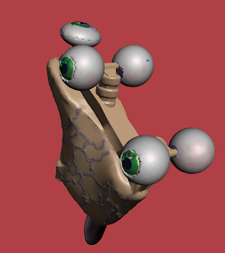
 I had lots of fun fancying up my people made roller skates, and decided to make it into a pair to make it more realistic. I took my original model back into Meshmixer to clean up the model (most notably the eyeball wheels), and learned the importance separating different parts of a model that you want to turn into different materials. I present to you, pictures captured for different moods, the finale of "skates made from people, for people." enjoy. or not, it's slightly creepy.


Thursday, February 4, 2021

Mesh Mashup- Selection and Refinement

After our breakout room critiques, I decided to go with my "human" roller skates. the original concept was taking man made into the most literal form, creating an object that is made by people, and making it out of people. the main idea I wanted to build on for my refinement was how unsettling the skates become the more realistic that they are. I decided to try and make it more human-like.

Original Idea


Refinement


suggestions that were brainstormed for this strange creation included turning the laces into hair, adding ridges to the tongue, and my favourite making the skin of the boot looked like it was stitched together in order to form the shape of the boot. along with that I added a reddish tint to the eyes to make them look somewhat bloodshot. overall, I just wanted to make it as creepy as possible.

Some simple additions were made, meant to create some extra unease, as the original build was but more intense.


Items From Thingiverse


Skate- https://www.thingiverse.com/thing:2707802/files
Eye- https://www.thingiverse.com/thing:3127426/files
Tongue- https://www.thingiverse.com/thing:4600295/files


Tuesday, January 26, 2021

Mesh Mashup - Concept Generation

 As an artist, I have become familiar with the idea of using others works for inspiration within my own artwork. with the idea of remix culture I have learned plenty of new information and have gained some ideas that are taken a step further, and literal pieces (not just the idea) of artwork are used in order to create new works.

I had a bit of a struggle approaching art from this new perspective, mostly with idea generation and how I wanted to place different objects and concepts together, but ended up having plenty of joy in creating my own builds. All of the objects are from thingiverse, with a few shapes here and there added from within tinkered.


Mashup 1: Tree of Knowledge

In many cultures and stories, plants and most specifically trees are known to hold knowledge. In the same way, books and the sharing of knowledge in general is an important part of being human, because we live through our own and others shared experiences and stories. For this mashup I decided to take that idea in a literal sense, putting the two together. I also found it a little ironic that we cause the destruction of one in order to create the other.

Tree- https://www.thingiverse.com/thing:2846782/files

Hatchet- https://www.thingiverse.com/thing:3792193/files

Book- https://www.thingiverse.com/thing:975039/files


Mashup 2: Oily Tea

Convenience is not always a good thing. This is meant to show the clear crossover between a casual convenience, like pouring yourself a lovely cup of tea in the morning, and a negative convenience. Having oil widely available is nice, maybe. but not as much at the cost of the many, many tonnes of oil that gets spilled into oceans and freshwater completely destroying entire ecosystems and rendering perfectly good water useless. (that's what the fish bowl is meant to represent)

Teapot- https://www.thingiverse.com/thing:2984264/files

Fish Dish- https://www.thingiverse.com/thing:1213049/files

Oil- https://www.thingiverse.com/thing:3844765/files


Mashup 3: Roller Skates- Made From people, For People

There was no particular motivation behind this strange creation, as soon as i saw a build someone had made of roller skates I thought to myself, what if the wheels where eyeballs? What does that say about me as a person? who knows. From that idea, this was created. with that being said, the eye wheels makes me think of the anxiety I get when I roller-skate by people in public, and I feel like everyone is watching me because I skate like a newborn baby giraffe. Maybe its just meant to induce anxiety, and that's it.

Roller Skate- https://www.thingiverse.com/thing:2707802/files

Eyeballs- https://www.thingiverse.com/thing:3127426/files

Tongue- https://www.thingiverse.com/thing:4600295/files


Mashup 4: Murder Rabbit

Looks can be deceiving. Just because something is cute, does not mean that it can not kick your butt, vice versa. I thought it would be interesting to add a scary element to something generally deemed as adorable and friendly. Here it is, a crazed rabbit with a knife. It looks like its asking for a hug, but I think we all know what the real plan here is. 

Rabbit- https://www.thingiverse.com/thing:600429

Knife- https://www.thingiverse.com/thing:684102/files

Hands- https://www.thingiverse.com/thing:2511612/files

Mashup 5: Garbage Flavoured Water

I was thinking about how there is an insane, ungodly amount of trash piled up all over the world that isn't recyclable, isn't sustainable, and does nothing but take up space. It seems to pile up almost as quickly as water comes pouring out of a tap. There is a lot of beauty in the world being covered up by peoples gigantic trash tap. This mashup is partially representational, and partly literal.

Tap- https://www.thingiverse.com/thing:610131/files

Trash Pile- https://www.thingiverse.com/thing:3658548/files

Trees- https://www.thingiverse.com/thing:279864/files

Flower Pot- https://www.thingiverse.com/thing:99658/files


Mashup 6: Candy Corn

A dumb little pun brought to life! It is a unicorn made out of candy. It has a candy corn horn, peppermint hoofs, gum-ball eyes, and a tail made of freezies.

Unicorn- https://www.thingiverse.com/thing:402596/files

Hoofs- https://www.thingiverse.com/thing:3458295/files

Horn- https://www.thingiverse.com/thing:2575426/files

Tail/Mane- https://www.thingiverse.com/thing:3100525/files


Mashup 7: The Taste Of Winning

Poking around at the idea of excessive spending on things that are not needed, and don't tend to prove beneficial towards someone, but unfortunately for different reasons end up being gravitated towards out of habit, or addiction, self sabotage, or maybe some other reason. this specifically is in relation to gambling, but it is one of many things that share the same traits.

Face- https://www.thingiverse.com/thing:2994999/files

Dice- https://www.thingiverse.com/thing:147883/files

Coins- https://www.thingiverse.com/thing:209089/files


Mashup 8: Working Couch

More often than not, couches are seen as and used for comfort.
with the amount of work I have been doing lately, I have taken to my couch to comfort me physically while I work myself mentally to get work done, and it definitely helps. Here is the most literal visual I could give you in relation to that idea. At some point, you spend enough time on the couch that you sort of just become part of it. a couch, but one that's getting plenty of work done, at that.

 Laptop- https://www.thingiverse.com/thing:1300304/files

Arms- https://www.thingiverse.com/thing:614366/files

Legs- https://www.thingiverse.com/thing:2648470/files


Mashup 9: New Article: Reasons for Destruction

As someone who often doom scrolls through news articles, one thing you learn quickly is that there tends to be much more negative, gruesome, fake, and uncomfortable news than there is of anything else. The mashup I made is to show how this always seems to be what jumps out, because unfortunately there is lots of it.

Newspapers- https://www.thingiverse.com/thing:3877186/files

Stumps- https://www.thingiverse.com/thing:3008880/files

Explosion- https://www.thingiverse.com/thing:19478

Person- https://www.thingiverse.com/thing:3873044/files


Mashup 10: A City Built On Bones

It is a city, quite literally built on the bones of the people. Hard work, and a beautiful skyline, but at what cost? The people, probably.

Skull- https://www.thingiverse.com/thing:1669249/files

City- https://www.thingiverse.com/thing:47622/files

Person- https://www.thingiverse.com/thing:3873044/files


Wednesday, January 20, 2021

Objectified Response- Dyson Design


    After watching the documentary Objectified, the one thing that intrigued me the most was definately the way in which Dyson vacuums are designed. (more specifically cordless ones) As they are explained in the film, they are for the most part made to more explicitly show the way in which they work quite clearly, which I think is pretty useful design-wise when it comes to vacuums. a good mix of addition to a design in order to show functionality, and simplicity to make it understandable. I decided to build a model of one of the many varying cordless designs, the one I like the most.

    What I enjoy the most about the design is that it communicates clearly with its bright red buttons where you can detach parts of the vacuum to attach other parts for your cleaning situation, whatever that might be.
The dust tank is also right at the top so its really easy to tell if your vacuum is full or not. the button to open the tank (the red button on the handle) is also right at the top so its super easy to empty as well. 
wow! it almost makes vacuuming fun! if you enjoy cleaning that is.
all in all, I think that it's just a really well designed vacuum. easy to use, easy to understand, as good design should be.


Papercraft Object: Prototype

Here is my first attempt at building the creation I made previously in Rhino, The Great Deku Tree. As a side note I opted out of adding the ...